Simple Slick SwiftUI Onboarding View
Learn how to use TabView for onboarding in SwiftUI
Apparently, even if SwiftUI 2.0 has powerful enough for production code, but sometimes they are still lacking documentation for a simple component like PagingView. As your information, there is now a native equivalent of UIPageViewController in SwiftUI 2.0 which is adding the .tabViewStyle modifier to TabView and pass PageTabViewStyle
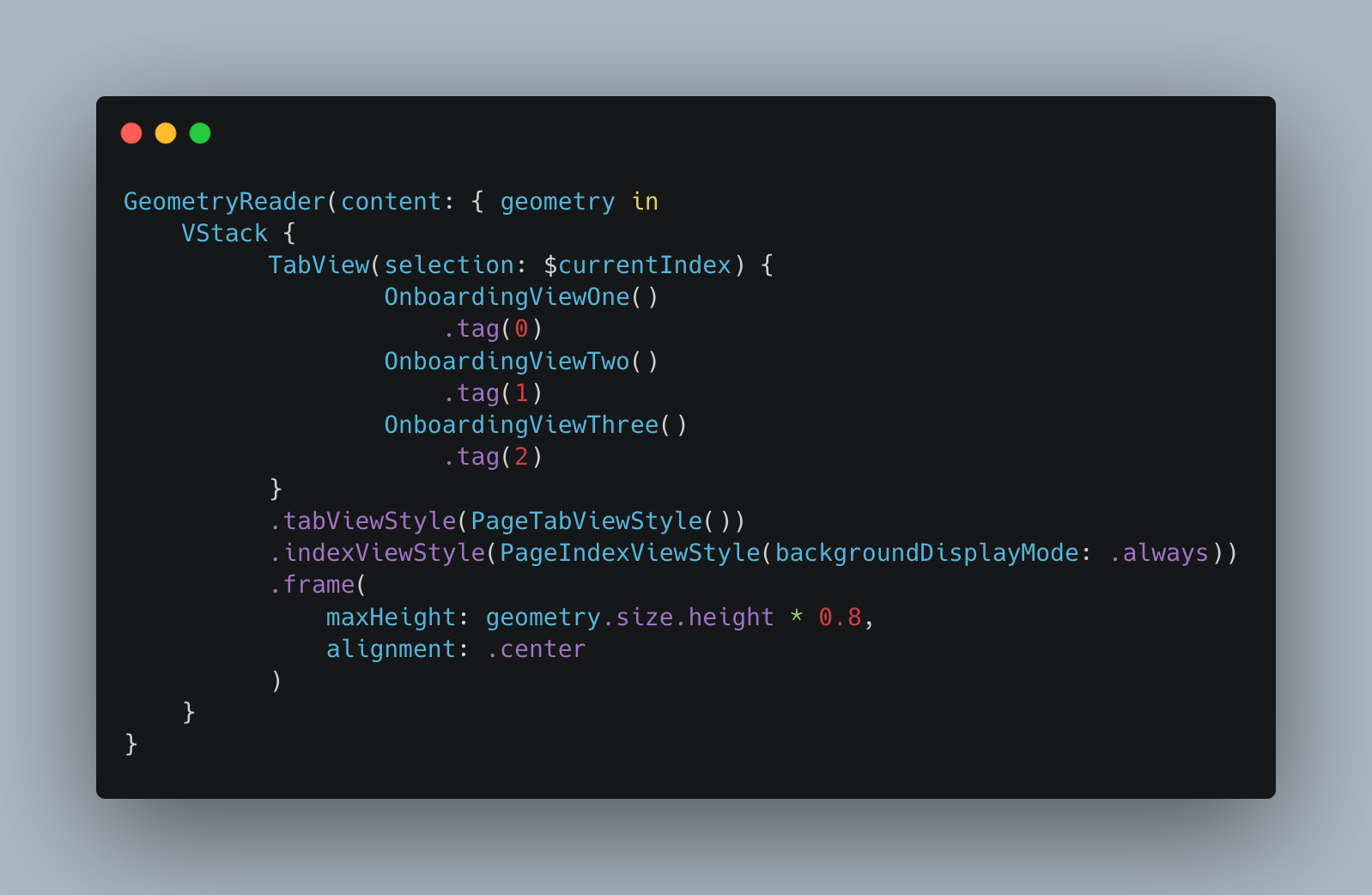
Let me go through step by step.
-
We will need to wrap our view with the GeometryReader in order to get the parent relative size position for configuring the onboarding view frame.
-
VStack is not necessary, in here I put it first because I will show you that we could animate some buttons later base on the view for each onboarding.
-
TabView is the important part here. We can use TabView for simulating our onboarding and we also can give the index of the current view position. Don’t forget to add the tag for each embedded onboarding view. The tag is for the identifier of the view that will become the selection state that we set on TabView. Every time the bindable selection state is changing, it will read the tag to get the correct identifier for the current view that needs to be displayed.
-
TabViewStyle modifier, we need to set our style to be PageTabViewStyle which is a new modifier for a paging view style on TabView.
-
IndexViewStyle is also important as it is the styling for the circle indicator. By default, it has a white background, so it won’t be visible unless we change our view background color. However, we can set it to always so we have a nice neat standard iOS Paging View indicator style
-
Now set up our view frame base on our parent size
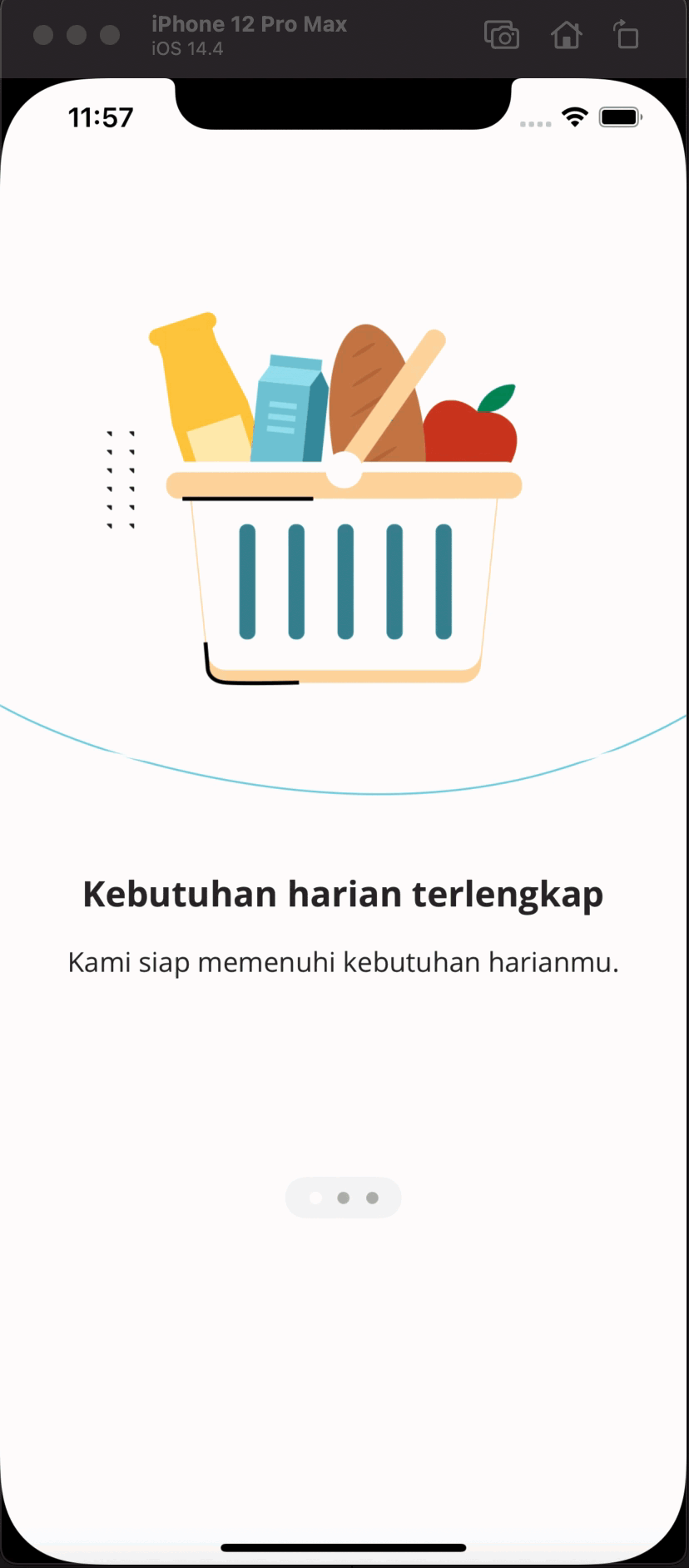
Once you have done all of the steps above you will get some result like below
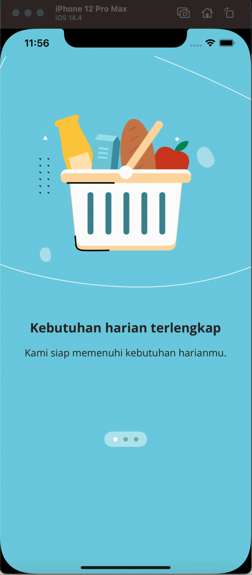
However, there is still some weird feeling. There is no smooth animation when swiping the view, and every view has the same white background. So now let’s try to have different colors for each view. See the code below.
 1private func switchColor() -> Color {
 2  let tabColor = TabColor(rawValue: currentIndex) ?? .one
 3  return tabColor
 4}
 5
 6GeometryReader(content: { geometry in
 7  VStack {
 8    // .. //
 9  }
10})
11.background(
12  switchColor()
13    .edgesIgnoringSafeArea(.all)
14)
15.animation(.easeInOut(duration: 0.2))-
We made
switchColorfunction which generates a color for each view depend on the currentIndex -
In the GeometryReader set your background and we want to ignore all of the safe areas
-
Then simply add
.animationhere and you can choose any of the animation styles you wish, in this case, I pick.easeInOut
Now you will see a better onboarding view like below
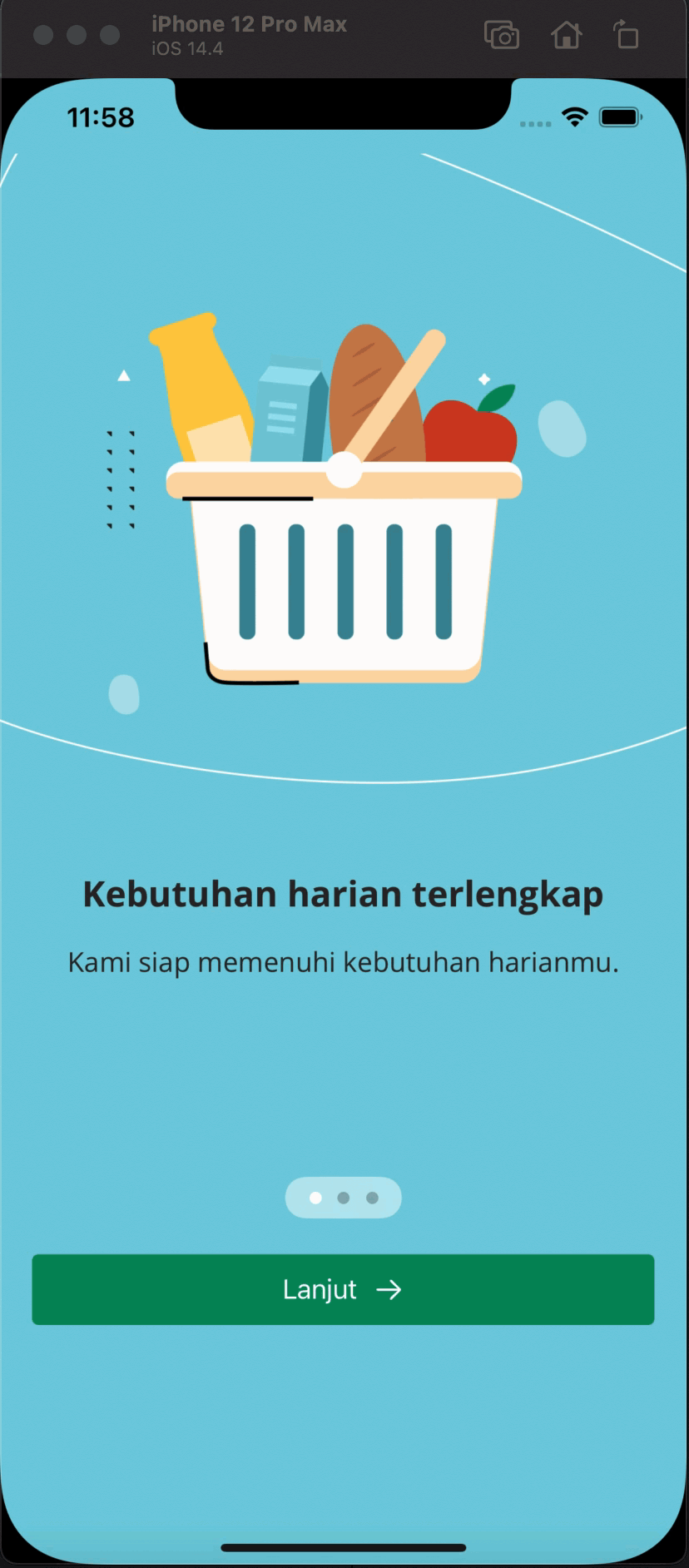
Let’s add one more cool thing to our onboarding view, which is adding the next button and back button, as well as the free animation from SwiftUI for free. See the snippet below
 1GeometryReader(content: { geometry in
 2  VStack {
 3      // .. //
 4      HStack(alignment: .center, spacing: 8) {
 5        if currentIndex > 0 {
 6          Button(action: {
 7            currentIndex -= 1
 8          }) {
 9            HStack(alignment: .center, spacing: 10) {
10              Text("Kembali")
11                .foregroundColor(ColorStyle.emerald.color)
12            }
13          }
14          .frame(
15              minWidth: 0,
16              maxWidth: .infinity,
17              maxHeight: 44
18          )
19          .background(Color.white)
20          .cornerRadius(4)
21          .padding(
22              [.leading, .trailing], 20
23          )
24        }
25        Button(action: {
26          if currentIndex != 2 {
27            currentIndex += 1
28          }
29        }) {
30          HStack(alignment: .center, spacing: 10) {
31            Text(currentIndex == 2 ? "Mulai" : "Lanjut")
32              .foregroundColor(.white)
33              All.arrowRight
34                .accentColor(.white)
35          }
36        }
37        .frame(
38            minWidth: 0,
39            maxWidth: .infinity,
40            maxHeight: 44
41        )
42        .background(ColorStyle.emerald)
43        .cornerRadius(4)
44        .padding(
45            [.leading, .trailing], 20
46        )
47      }
48      Spacer()
49    }
50  }
51})
52.background(
53  switchColor()
54    .edgesIgnoringSafeArea(.all)
55)
56.animation(.easeInOut(duration: 0.2))-
Let’s add 2 Buttons to our view. The first button is the previous button and the second button is the next button with an arrow inside the button. Since there are 2 buttons then we will use HStack to wrap it.
-
We will put logic to our button. The first button only showing if the index is not 0 and we will decrement the currentIndex value by one every time we click on it.
-
The second button we always showing it however there are 2 different texts, if it is the first index then it will have “Start” text and “Continue” for the second afterward. We also increment the currentIndex value by one every time we click on the button.
-
Then we can put some styling like background, corner radius, padding, height, and width. Let’s put .infinity for maxWidth so the button will fill up the available space on the HStack.
Now you will see the amazing result like below
Easy right? So now it is your turn for creating the amazing onboarding view for your application!